Sheridan Nurseries: Social Gardening App
Experience it on InvisionHow might we enhance the user experience and promotion of products for an existing company with an already engaged user base?
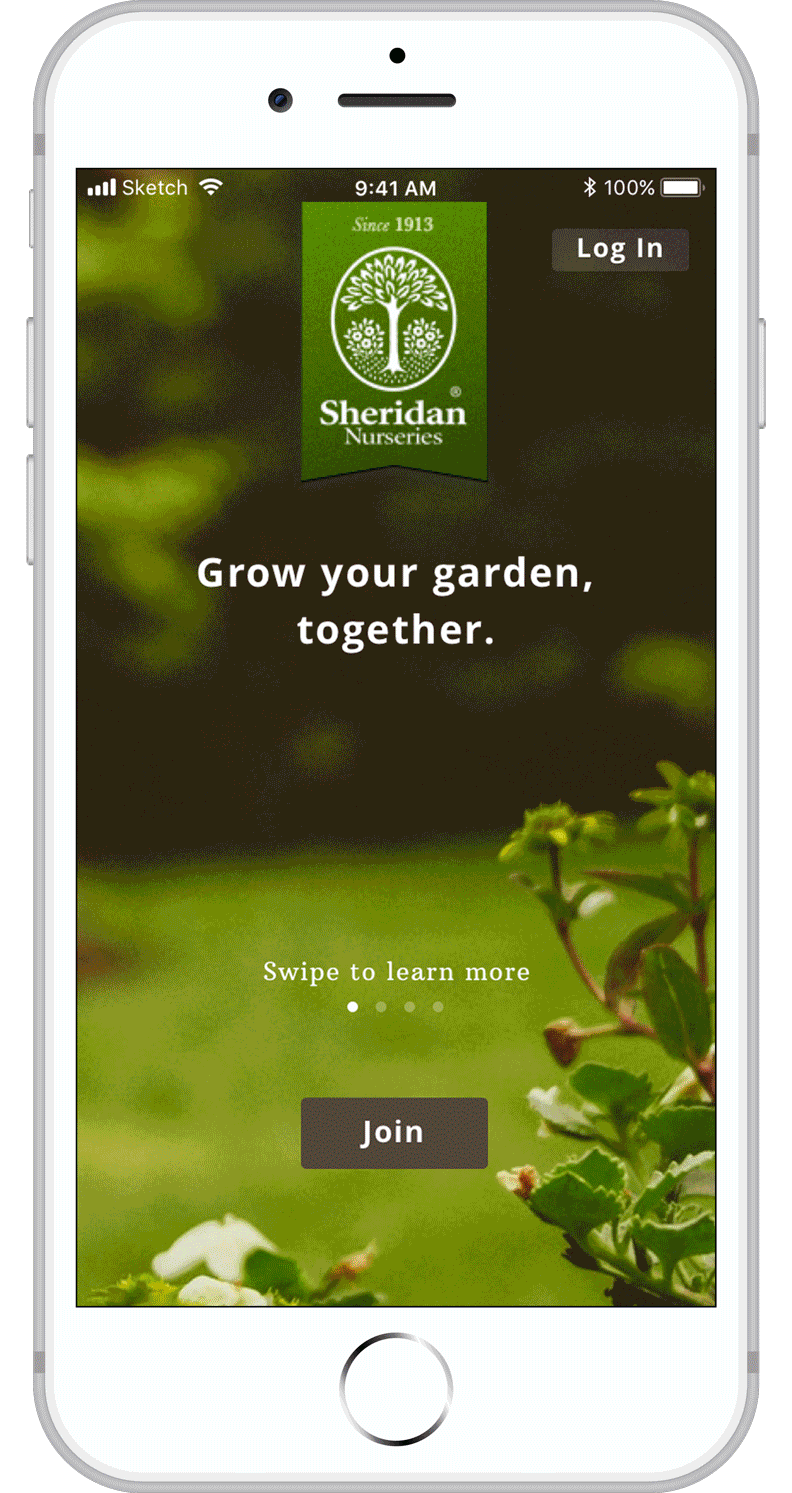
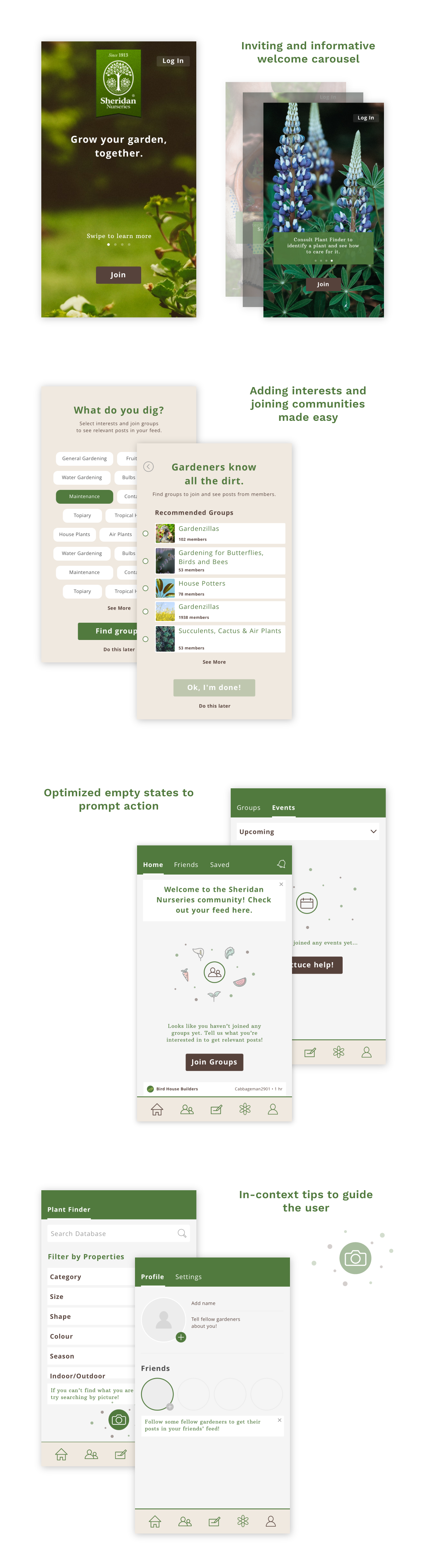
Design a social network platform for Sheridan Nurseries to encourage communication and sharing between users while introducing products as part of learning materials. The main focus of this project was also to create an onboarding experience that would attract and retain users by designing an informing and inviting welcome screen carousel, focused tips and maximizing empty states.
From research on the company and its existing online presence, it became evident that there was potential to design a dedicated social network app for Sheridan Nurseries for the following reasons:
From the research performed on its existing website and social network platforms, I created a rough persona to base the app on. I then determined the following job stories to tackle the user’s needs:
When I encounter specific problems with my plants, I want to find relevant guidance and support, so that I can grow healthy plants with ease.
When I see a plant that I really like, I want to know what it is called and what kind of care it needs, so that I can know if I want to buy it or not.
The focus of the project was on the onboarding experience, however, this step was required to determine the main functions of the app.
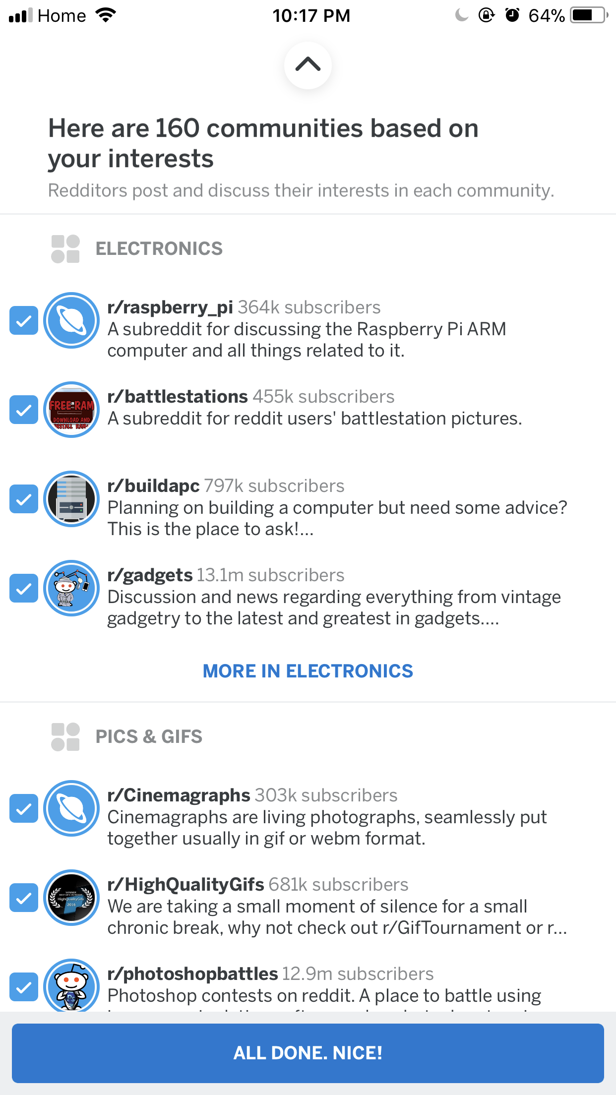
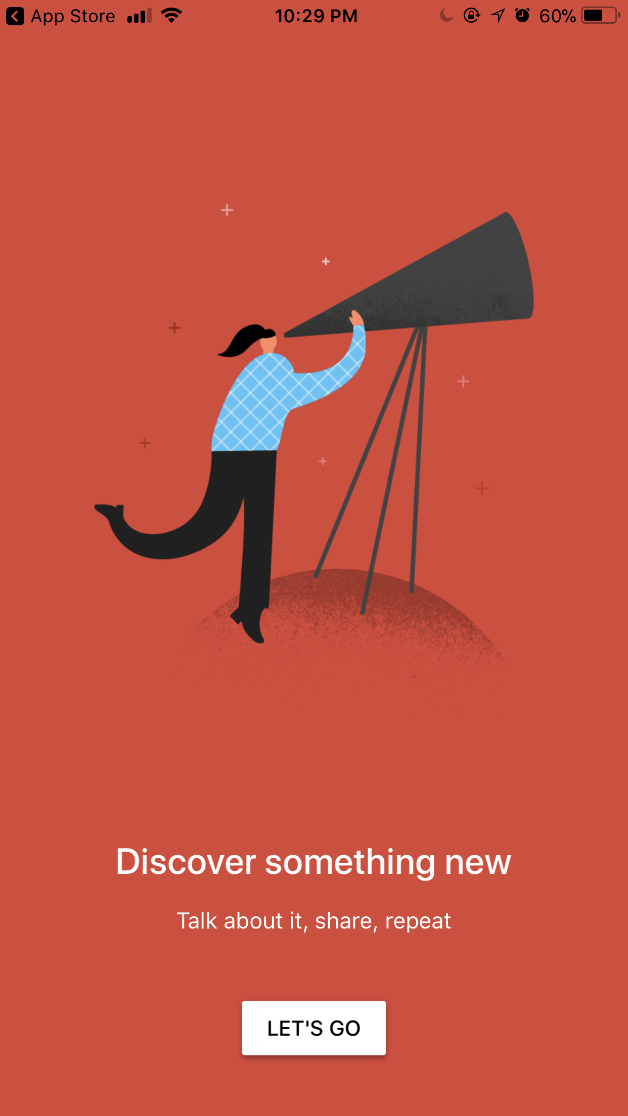
A look at other established social network apps provided some insight into effective onboarding methods that also helped inform the process:
Rather than designing the user flows for just the onboarding experience, they were also created for the main tasks of the app. This way it would be easier to incorporate contextual onboarding and only when needed.
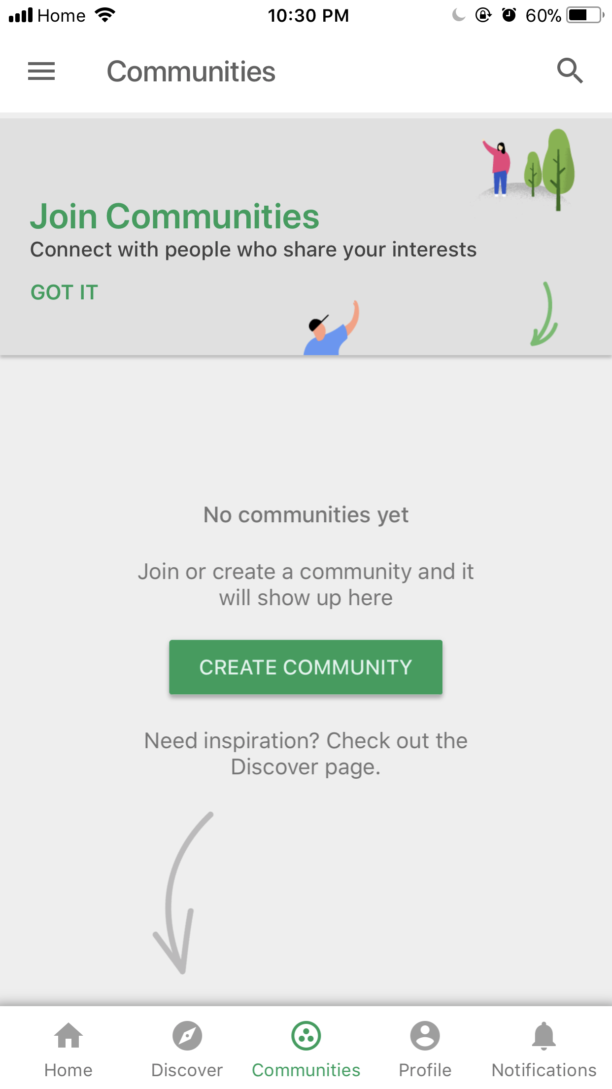
I then went about creating low fidelity wireframes for the entire app, as I wanted to see how well the onboarding process from the user flows actually worked when laid out. From initial testing, many holes in the interaction were found. Among them included the placement of a friends and events page, which users felt were too hidden and something they felt was important. I was also able to identify more potential uses for the plant identifier feature, as different people had different perspectives on how they would use it. Specific to the onboarding experience, many felt the in-context tips were appropriate and unobtrusive. The process also helped to reinforce the need for a welcome carousel, as many felt that just the home screen on its own was not enough to show some of the more interesting features of the app to encourage sign ups.
In the high fidelity wireframes, I was able to go through the actual content with people and receive suggestions for specific wording and calls to action. It was particularly useful in working out gaps in the flow and getting a better sense of hierarchy in the pages.
The development of the visual design involved trying to keep with their current brand personality while invigorating it with a fresher font pairing that would be more legible for larger bodies of text, as well as using more curated photography and adding secondary colours for use in buttons and different states. Animation was also used as another way to add delight for the user.
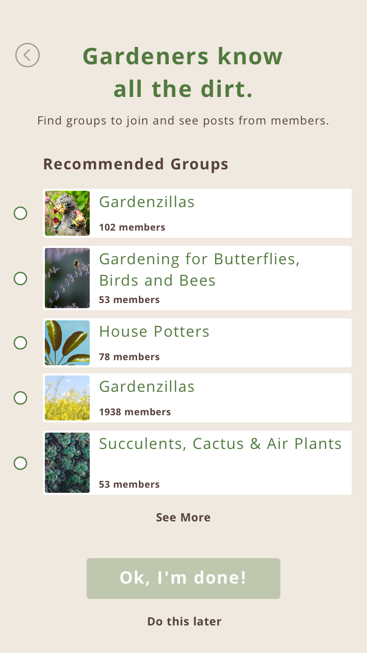
Pages of the app that take advantage of fresh photography, animation and cards to visually break apart information.
One main challenge encountered was in the design of the groups card. The following shows some of the variations explored:
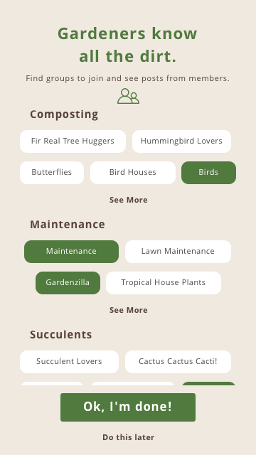
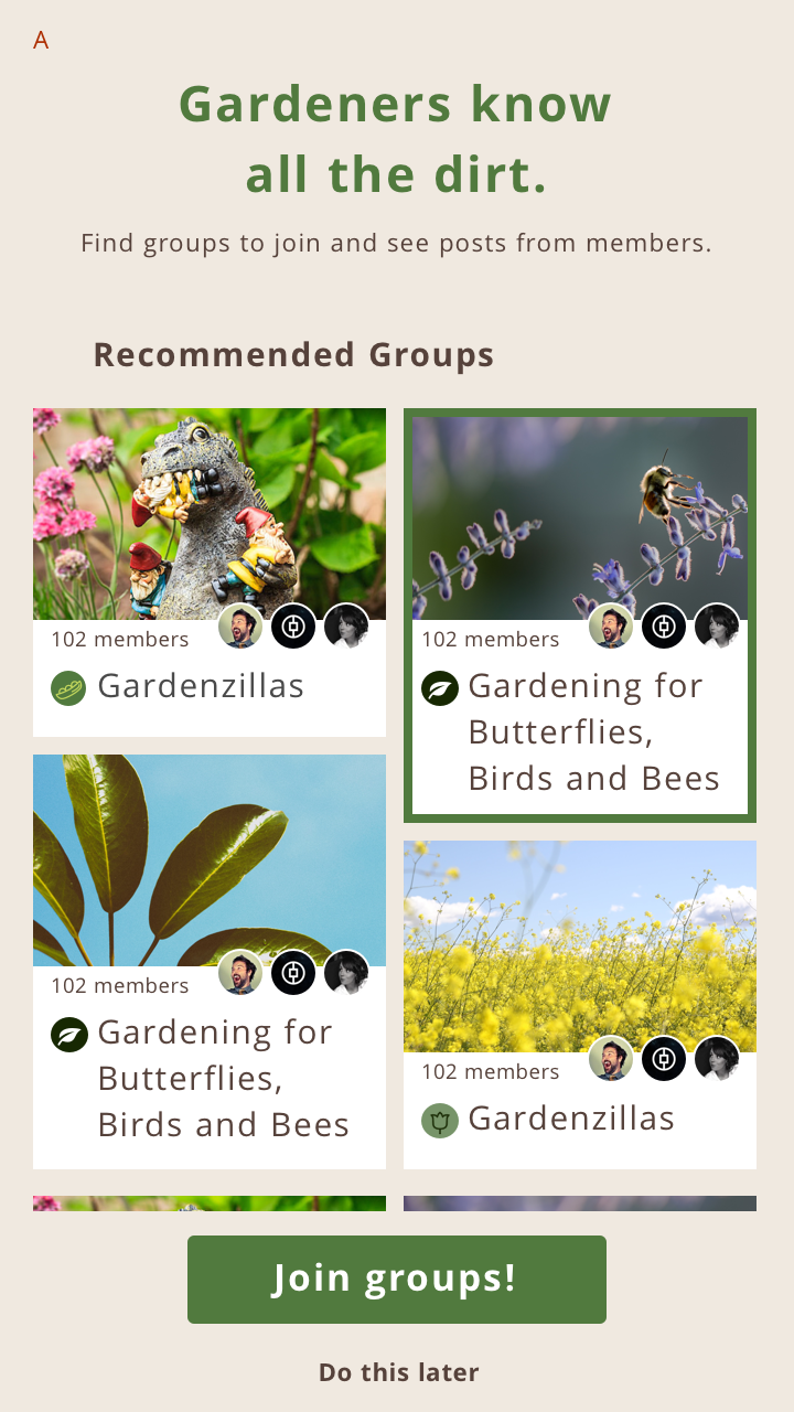
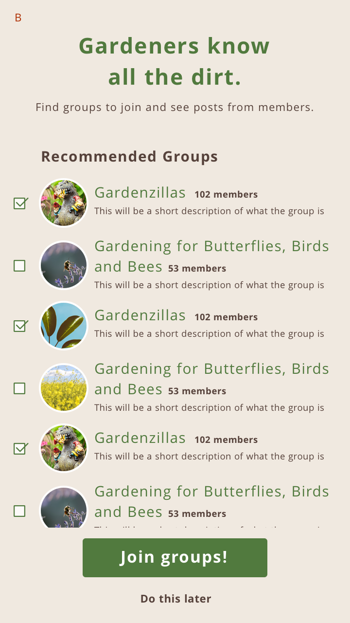
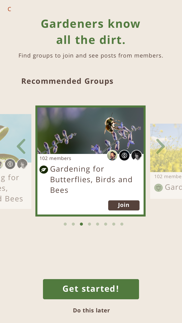
In the first variation, it became evident during testing that it looked too similar to selecting interests and that it wasn’t apparent that they were groups. Many people preferred the second variation visually, but found the third variation more easier to digest and scroll through. Therefore, a combination of both was created for the final design:
Focusing on the onboarding experience was a great exercise that helped to place myself in the user’s shoes, and approach the design to make it as easy to use as possible. Some key things I became aware of during the process were:
When designing future projects, I hope to keep these insights in mind and try keep in mind that there will always be a first-time user.

