Logbot: Your smartest travel journal
Experience it on InvisionOur travels are special to us. We want to remember the new places, cultures and special memories that we make along the way. Remembering is not always easy though - we’re too tired, too present in the moment, or too overwhelmed by the amount of pictures we need to go through to jog our memories.
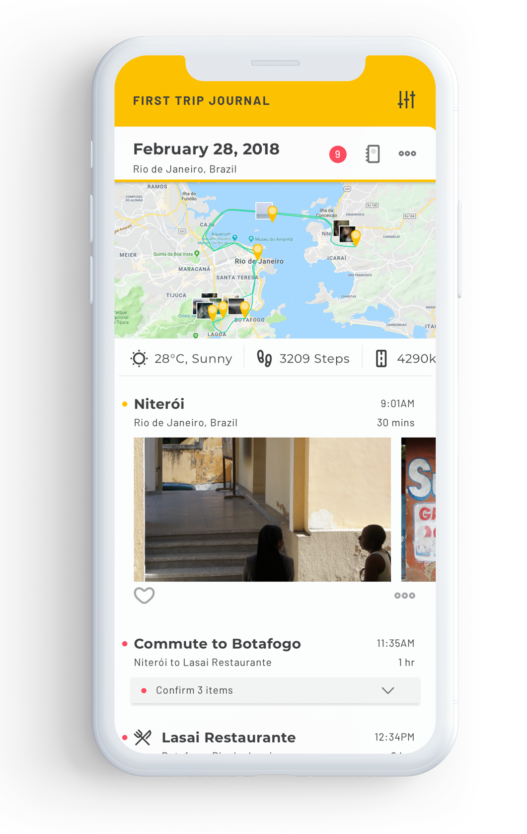
I designed an app that helps you create content and reminds you of your favourite trip moments when you get home, so that you can breeze through all your stories with friends and family.
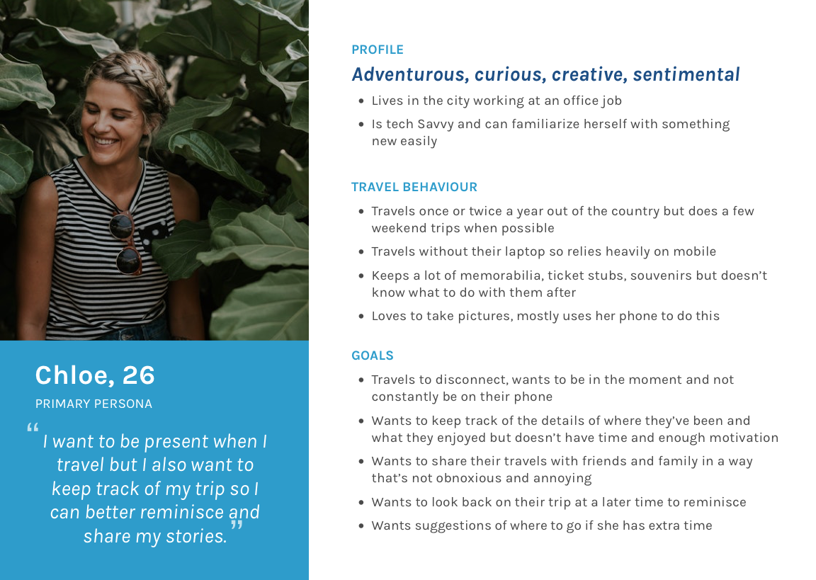
A series of open-ended interviews were conducted, asking users about the why’s and how’s of their travel journaling habits. These were recorded on audio, which really helped when it came to mapping out some of the trends. I created an affinity map on Trello, and was able to identify some main issues and a persona and job stories that encapsulated some of these key insights.
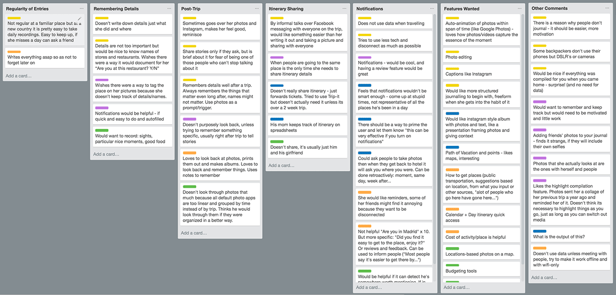
Travellers are often too busy to be writing things down.
They might set out to journal, but will usually stop after a few days.
Being on their phones to write down notes takes away from them
being present,
and they never remember to anyways.
Telling trip stories
to family and friends is a challenge when they are not prepared.
Pictures are great
visual cues
for remembering. However, it is often a daunting task to go through hundreds of photos and pick out the most memorable moments.
Everyone likes to remember different things
- some want to remember factual, detailed information while others care more for the sentimental aspects.
Some further research went into the benefits of journaling. Studies show that it can be helpful with short-term memory and that it is often prescribed as a supplementary method in support of regular therapy.
A competitive analysis was performed by looking into various journaling, tracking, trip planning and check-in apps. By comparing the many features available across a wide range of apps, the gaps and opportunities opened up. Three main points arised. These became the basis for creating a more unique experience for users:
Structure
While some journaling apps were very thorough, they were also very structured and did not allow for much flexibility or creativity.
Delight
Asides from native photo apps, none of the journaling apps presented a summary of your trip in a very visual way conducive to storytelling.
Motivation
As identified in the user interviews, there was a real need for motivation. Some apps had reminder features, however none made it easy enough to execute on these reminders.
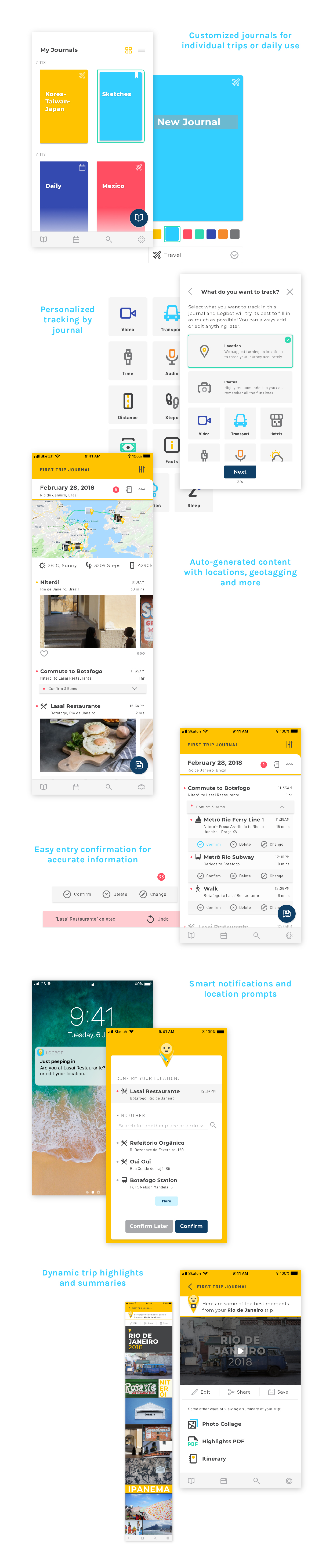
After conducting research, I first sketched out all the ideas and features I had in mind. I then built out a content model, to define all the different types of content that would be required, and their relationships to each other. Because of the large amount of data that needed to be tracked, this was very helpful for me to visualize the different content and metadata to inform the design.
From there, I mapped out user flows based on the job stories I had previously identified. These informed the low-fidelity wireframes that I sketched out for testing. I started out with focusing on a preview and edit mode that the user would toggle between for editing entries.
Through a series of testing high-fidelity wireframes with different users, gaps in the interactivity were identified and critical questions arose. By giving the user too much flexibility was I making the task too complicated for the average user? User testing helped to establish that while power users would love to be able to manipulate individual elements, a majority found it overwhelming. Thus, a pivot was required and the solution was to create templates to balance flexibility in layouts and ease of use.
Before: too much flexibility given to the user for editing journal structure
After: templates that provide less flexibility but much less overwhelming for the user
Through a series of mind maps and sketches, the name and logo was formed to speak to the automated nature of the app, while giving the brand an approachable and friendly personality. Logbot was further designed to be part of a system, where it can be contextualized with the items it holds.
Mind mapping and logo sketches
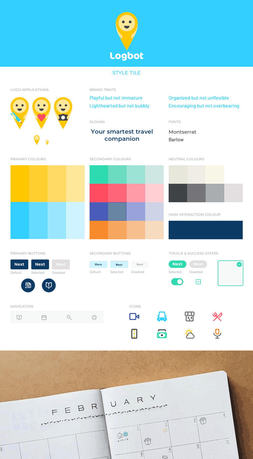
Style Tile
The process of creating visual mockups consisted of a lot of exploration. One such instance where I explored many variations was the screen for choosing what to track. Because of the importance of selecting locations and photos as a critical source for content generation, it was necessary to call attention to them for a first-time user. I explored alerts, but from rounds of feedback and looking at industry standards, I arrived at an interface that would call more attention to the two items without a disruptive notification. In other screens, the use of A/B tests were performed to test smaller interactive elements, such as the place of time as well as buttons for highlighting and archiving.
Iterations of journal tracking setup page to arrive at the final version
As a final project to the immersive 10-week UX & Product Design course at Bitmaker, this was a very appropriate undertaking that allowed me to put into practice all the practical and technical techniques that we had learned. The entire process of designing Logbot took 4 weeks, from the discovery phase to final refinement of the high-fidelity prototype and I took on the role of the only UX/UI designer.
As I wanted to put in all the features I could think of in the beginning, not only did testing and gaining feedback allow me to eliminate lower priority items and develop a higher quality MVB, it also gave me confidence in my design choices. Some future plans would include exploring: marketing and how it would get into the hands of users and be able to generate profit, the trip planning phase, integration with third-party apps to provide richer content, suggestions and reviews, a social component of adding friends and sharing trips and expenses, editing of the highlights reel and collages and the map, timeline and calendar views.
Lastly, I would want to delve into understanding how development of the app would be done. It would have been very interesting to have worked as a team to accomplish all of this, but doing so individually allowed for a more thorough understanding of each of the phases. It was definitely a very insightful project and one that I had a lot of fun designing! Not a single day went by that I wanted to stop working on it and further pushing its potential. Thus, Logbot was not only just a learning experience, but a reaffirmation that this is the type of work that I would throw myself into.

